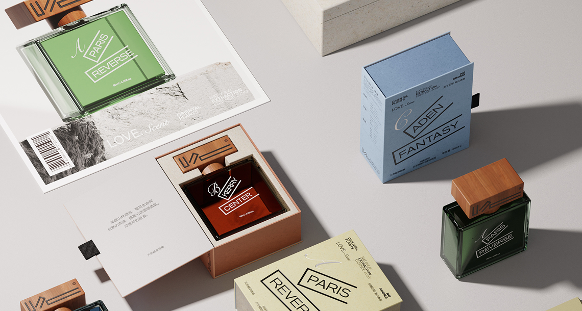

Color is brand identity made visible. A perfume box that arrives in a slightly different shade of burgundy than the approved standard — even a shift invisible in isolation but apparent when placed alongside previously produced stock — creates a brand consistency problem that has downstream consequences across retail display, consumer perception, and re-order management.
Color consistency in packaging print is not automatic. It requires active measurement, controlled production processes, and a clearly defined acceptance standard. This article explains the measurement science behind color consistency control for perfume packaging boxes and the quality protocols that separate premium production from commodity print.
Why Color Consistency Is Difficult to Achieve
Variables That Cause Color Shift
Offset print color is the product of ink film thickness, ink chemistry, substrate surface absorption, and the interaction between multiple transparent ink layers in the CMYK process. Any change in any of these variables produces a perceivable color shift. The variables that change most frequently in production include:
- Ink batch variation: Different production lots of the same ink specification can vary in pigment concentration
- Substrate variation: Paper and board from different mill batches vary in whiteness, surface texture, and ink absorption
- Press conditions: Temperature, humidity, blanket pressure, and ink viscosity all drift during production
- Lamination: Gloss, matte, or soft-touch lamination films shift the perceived color of the printed surface beneath them — a color that matches the standard before lamination may not match after
The Human Eye Is Not a Consistent Instrument
Visual color assessment is inherently subjective — it varies between observers, changes with fatigue, and is dramatically affected by the light source under which assessment is performed. The same print viewed under fluorescent office lighting (approximately 4,000K color temperature) and under D65 daylight standard illumination (6,500K) will appear to have noticeably different color. Packaging designed to look correct under boutique retail lighting (warm, approximately 2,700K) may appear flat under cold warehouse fluorescents. Objective instrument measurement eliminates this variability.
Instrument-Based Color Measurement
Spectrophotometer
A spectrophotometer measures the reflectance of a printed surface across the full visible spectrum (380–780nm) and calculates colorimetric values in a standardized color space. For packaging quality control, the CIE L*a*b* (CIELAB) color space is standard — L* defines lightness, a* defines the red-green axis, and b* defines the yellow-blue axis. Any printed color can be expressed as a set of L*a*b* values, and the difference between two colors can be quantified as a single number: Delta-E (ΔE).
Delta-E: The Color Difference Standard
Delta-E (ΔE) is the numerical measure of total color difference between a sample and a standard. The generally accepted industry thresholds are:
- ΔE < 1.0: Difference imperceptible to trained human observer — considered a perfect match
- ΔE 1.0–2.0: Slight difference perceptible only under controlled conditions — acceptable for most premium packaging
- ΔE 2.0–3.5: Noticeable difference to trained observer — marginal acceptance for standard commercial packaging
- ΔE > 3.5: Clearly visible color difference — rejection criterion for brand-sensitive packaging
For luxury and prestige fragrance packaging, Panda Glass specifies ΔE ≤ 1.5 as the production acceptance standard for brand color panels measured against the approved color standard.
The Color Approval Process
Step 1 — Color Standard Definition
Color standards for fragrance packaging should be defined with Pantone Matching System (PMS) references and, where possible, physical color standards produced on the actual production substrate with the actual surface finish. A Pantone reference alone is insufficient — the same PMS color printed on gloss-laminated board and matte-laminated board will appear visibly different, and the conversion from PMS to CMYK process involves inherent tolerance.
Step 2 — Press Proof Approval
Before bulk production, a press proof — printed on production equipment using production inks and production substrate — is submitted for color approval. The press proof is measured with a spectrophotometer and compared to the color standard. Measurement locations are defined on the print design (typically brand color panels, background fields, and critical decorative elements). ΔE values are recorded and reviewed against the acceptance standard before approval is granted.
Step 3 — On-Press Color Control
During bulk production, color is monitored at defined intervals — typically every 500–1,000 sheets — using the spectrophotometer. Measurements are compared to the approved press proof standard. Press operators adjust ink feed to maintain color within the ΔE tolerance. Color measurement records are maintained as part of the production quality documentation package.
Step 4 — Lamination and Finishing Verification
Color is re-measured after lamination and after any additional finishing processes (UV varnish, foil stamping) that affect perceived color. Lamination film selection has a significant impact on color appearance — premium packaging specifies lamination film matched for optical properties to the design intent, not simply the lowest-cost available film.
Pantone vs. CMYK: Understanding the Trade-Off
CMYK process printing achieves most — but not all — colors in the Pantone library. Highly saturated colors (vibrant reds, deep blues, bright greens) are particularly difficult to reproduce accurately in CMYK. For brand colors in these ranges, specifying a Pantone spot color (a pre-mixed single ink) produces significantly better accuracy than CMYK process. The cost trade-off is an additional printing unit (and the associated make-ready cost) for the spot color ink.
For fragrance brands where precise brand color is a core identity element — particularly where packaging is produced across multiple suppliers or markets — spot color specification for primary brand panels is strongly recommended. The accuracy benefit far outweighs the modest additional cost.
What Buyers Should Specify and Request
- Color standard: Physical color standard on production substrate with agreed surface finish
- Acceptance criterion: ΔE ≤ 1.5 for luxury applications; ΔE ≤ 2.0 for commercial applications
- Press proof: Spectrophotometer-measured press proof with ΔE values vs. standard, submitted before bulk approval
- In-production monitoring: Measurement frequency and records included in pre-shipment QC documentation
- Lighting condition: All visual color assessment under D65 / 6,500K standard illumination
Conclusion
Color consistency is a measurable, manageable quality parameter — not a matter of luck or subjective impression. Brands that define clear color standards, require instrument-measured press proofs, and specify ΔE acceptance criteria in their purchase orders consistently receive more consistent color quality than those who rely on visual approval alone. Panda Glass provides spectrophotometer color measurement data with every print production run, with records available in pre-shipment QC packages.
Request color standard documentation or QC specification templates: info@pandaglass.com | www.pandaglass.com