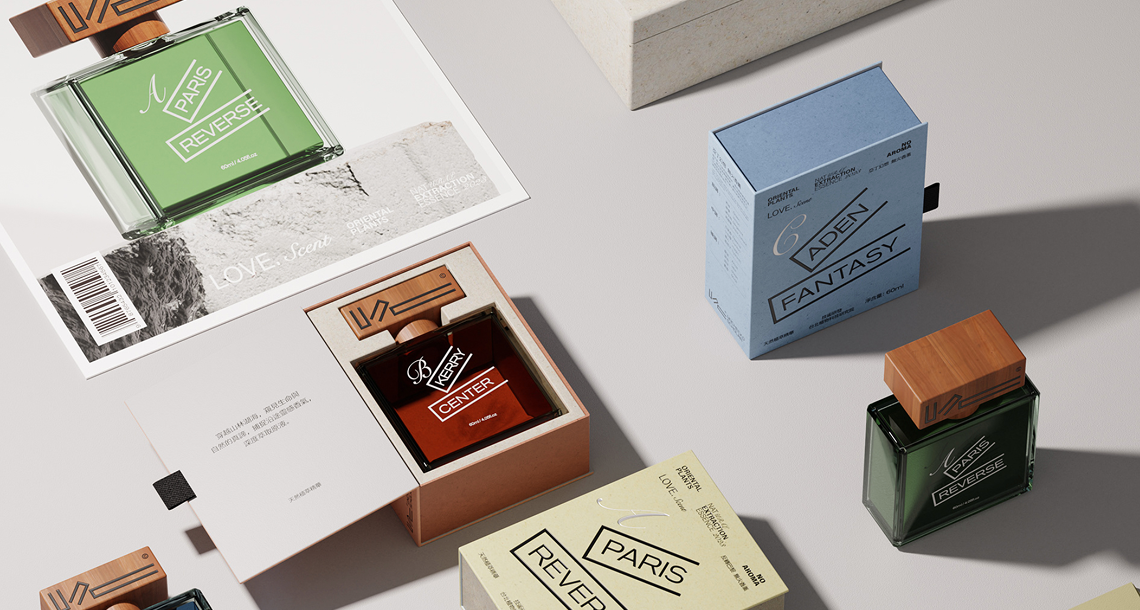
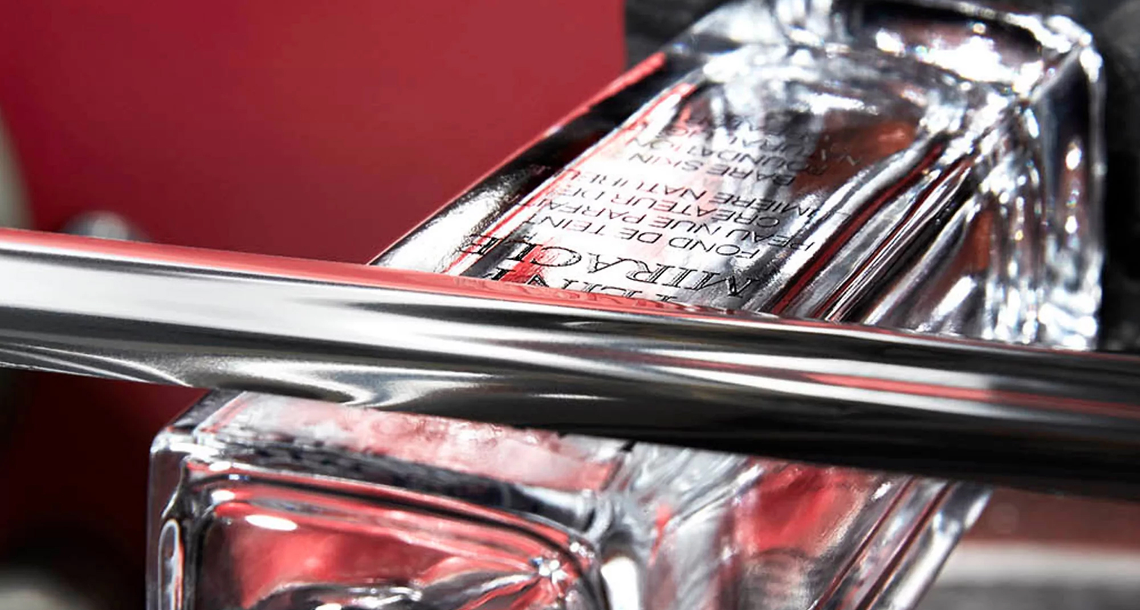
Precision manufacturing produces a vessel of consistent geometry and structural integrity. Finishing transforms that vessel into a brand object — something that communicates a point of view before it is ever opened.
Introduction: Where Engineering Ends and Craft Begins
A perfectly formed glass bottle, fresh from the annealing lehr, is a blank statement. Its walls are uniform, its dimensions precise, its surface optically clear. It is, in every technical sense, correct. But correctness is not distinction.
The finishing stage is where a fragrance vessel acquires its identity. A matte black coating and a single hot-stamped logo communicate something entirely different from a transparent bottle with full-coverage gradient and electroplated metallic collar — even if the underlying glass geometry is identical. Finishing is the vocabulary through which packaging speaks, and the fluency with which a brand deploys that vocabulary is one of the most reliable signals of its sophistication.
This article examines the primary finishing techniques available to fragrance packaging — screen printing, hot stamping, electroplating, and gradient coating — with attention to the technical considerations that determine whether each technique delivers on its visual promise or falls short of it.
Part One: Screen Printing — The Foundation of Surface Communication
Screen printing is the most versatile and widely used surface decoration technique in fragrance glass, capable of reproducing everything from a minimal single-color logo to a complex multi-layer decorative composition. Its ubiquity, however, should not be mistaken for simplicity — executed at the level that premium fragrance packaging demands, screen printing is a precision process with significant technical depth.
How It Works
In glass screen printing, ink is forced through a fine mesh screen onto the bottle surface using a squeegee. Each color requires a separate screen, and each screen must be precisely registered to the bottle’s position to ensure that multi-color designs align correctly. After application, the ink is cured — typically in a kiln at temperatures between 520°C and 580°C for ceramic inks — fusing it permanently to the glass surface.
This fired ceramic ink is what differentiates glass screen printing from the paper or fabric equivalent. The kiln-firing process creates a bond between the ink and glass at the molecular level, producing decoration that is genuinely part of the surface rather than sitting on top of it.
Abrasion Resistance: The Test That Matters
For fragrance packaging, the critical performance criterion for any surface decoration is abrasion resistance. Bottles are handled repeatedly during filling, capping, boxing, shipping, and retail display. They rub against each other in transit. They are picked up and set down on glass shelves dozens of times before purchase.
Printed decoration that degrades under this handling does more than look poor — it communicates that the brand’s attention to detail stops at the surface. This is why abrasion resistance testing is not optional for any brand serious about packaging quality.
The standard test methodology involves rubbing the decorated surface with a defined abrasive material under specified pressure for a defined number of cycles, then assessing the result against a visual scale. For ceramic-fired inks on glass, a well-executed application should show no visible degradation under conditions that simulate the full distribution and retail lifecycle of the product.
Key variables that determine abrasion resistance outcomes include ink formulation, firing temperature and profile, surface preparation prior to printing, and ink layer thickness. A manufacturer who can provide test data — not just assurances — for their standard print specifications is a manufacturer who has actually validated their process.
Registration and Color Consistency
In multi-color applications, registration accuracy — the precision with which successive color layers align — directly determines whether the finished decoration looks intentional or amateurish. Automated rotary screen printing equipment achieves registration tolerances of ±0.1mm or better. Manual or semi-automated processes introduce human variability that compounds across color passes.
Color consistency across a production run is equally critical for brands that maintain visual standards across markets and retail channels. Color variation that is imperceptible within a single batch becomes visible when bottles from different production dates are displayed side by side. This is managed through rigorous ink batch control and systematic color measurement — practices that should be standard, not exceptional.
Part Two: Hot Stamping — Metallic Precision and Durability
Hot stamping — also referred to as hot foil stamping or bronzing — is the technique of choice when a brand requires a metallic finish with the crispness and durability that printing cannot achieve. It is the defining decoration of premium fragrance packaging: a precisely applied gold, silver, or custom metallic element that reads as luxury regardless of the surrounding context.
The Stamping Process
A heated die — engraved with the design to be transferred — presses a metallic foil against the glass surface under controlled temperature and pressure. The heat activates an adhesive layer in the foil, bonding the metallic film to the glass at the contact points while the surrounding foil releases cleanly. The result is a sharp-edged metallic impression with a surface quality — reflectivity, depth, texture — that cannot be replicated by metallic inks.
The precision of the die engraving directly determines the quality of the stamp. Fine serifs, hairline borders, and small-point text are all achievable in hot stamping, but only when the die is cut to appropriate tolerances and the stamping parameters (temperature, pressure, dwell time) are correctly calibrated for the specific foil and glass surface.
Foil Selection: More Than Aesthetic Choice
The foil itself is a technical specification, not just a color selection. Foil products differ in their adhesion chemistry, their resistance to solvents and abrasion, and their behavior at different stamping temperatures. A foil optimized for paper or board will not perform correctly on glass — it requires specific glass-compatible foil products, properly selected for the glass surface treatment and finish coating in use.
For fragrance packaging, where bottles may be stored in environments with significant temperature variation and where fragrance solvents may contact the bottle exterior, foil durability under chemical and thermal stress must be validated, not assumed.
The Luxury Signal of Registered Embossing
Hot stamping becomes particularly powerful when combined with embossing or debossing — creating a metallic element that also has physical relief. A raised logo in gold foil, precisely positioned on a weighted glass base, communicates something qualitatively different from a flat printed equivalent. The tactile dimension — the slight resistance under a fingertip — activates the sense of touch in a way that surface decoration alone cannot.
This combination requires a die capable of simultaneous heat and pressure application for both the metallic transfer and the physical displacement of the surrounding surface coating or glass — a more demanding process that separates manufacturers with full hot stamping capability from those offering basic foil application only.
Part Three: Electroplating — True Metallic Surfaces
Where hot stamping applies a thin metallic film to a glass surface, electroplating deposits actual metal — atom by atom — onto a prepared substrate. The distinction matters: an electroplated surface is a genuine metal surface, with the optical depth, weight, and permanence that only true metallization can produce.
The Electroplating Process for Glass Components
Glass cannot be electroplated directly — it lacks the electrical conductivity that the plating process requires. The standard approach for fragrance packaging components (caps, collars, decorative inserts) involves applying a conductive primer to the substrate, then building the metal deposit through sequential plating baths. The typical sequence for high-quality decorative plating on zinc alloy or ABS components is: copper base coat (for adhesion and smoothness), nickel intermediate (for corrosion resistance and surface leveling), and a final deposit of the target metal — gold, silver, palladium, or specialty alloys for custom tones.
Each stage in this sequence contributes to the final result. A copper base coat that is insufficiently thick will allow surface irregularities to telegraph through the nickel layer. A nickel deposit that is improperly controlled will produce uneven reflectivity in the final surface. The quality of the finished plating is the sum of every step in the process chain.
Uniformity: The Measure of Plating Quality
The primary quality criterion for decorative electroplating is deposit uniformity — consistency of metal thickness across the entire plated surface, including recessed areas, edges, and complex geometries. Variation in deposit thickness produces variation in color and reflectivity: a high point that is over-plated will appear brighter than a recessed area that received insufficient deposit.
Achieving uniformity on complex three-dimensional forms requires careful attention to rack geometry (how components are positioned in the plating bath), current density distribution, and bath chemistry maintenance. These variables interact, and managing them requires consistent process discipline, not intermittent quality checks.
For brand owners, the practical test of plating uniformity is straightforward: under controlled directional lighting, a uniformly plated surface should reflect as a single coherent plane, without visible variation in tone or brightness across its geometry.
Longevity and Environmental Considerations
Electroplated finishes for fragrance packaging must withstand handling, fragrance solvent contact, and storage conditions across a product lifecycle that may span several years from production to final consumer use. Accelerated aging tests — simulating temperature cycling, humidity exposure, and UV exposure — are the appropriate basis for validating plating durability in specific end-use conditions.
On the environmental dimension, modern decorative plating has evolved significantly. Trivalent chromium processes have largely replaced hexavalent chromium in compliant facilities. Responsible wastewater treatment and chemical management are standard requirements for suppliers operating under REACH and RoHS frameworks. Brands sourcing plated components should verify compliance documentation rather than accepting assurances.
Part Four: Gradient Coating — Depth, Atmosphere, Modernity
Gradient coating — the application of color that transitions continuously from one tone to another across the bottle surface — has become one of the defining aesthetics of contemporary fragrance packaging. It achieves something that solid coatings cannot: a sense of depth and luminosity that makes the bottle appear to change as the viewer moves or as the light shifts.
Application Methods
Gradient effects on glass are achieved primarily through spray coating processes, where the coating application is varied systematically across the bottle height or circumference to produce the desired transition. The technical challenge is achieving smooth, banding-free gradients — transitions where no discrete boundary between tones is visible to the eye.
This requires precise control of spray parameters (atomization pressure, spray angle, conveyor speed, coating viscosity) and consistent bottle positioning throughout the coating pass. Automated spray systems with programmable profiles achieve gradient consistency that manual application cannot replicate, particularly for production runs where hundreds or thousands of units must match an approved standard.
Color Depth and Translucency Control
The visual quality of a gradient coating depends on the relationship between the coating’s color depth and its translucency. A coating that is too opaque eliminates the glass’s natural luminosity — it reads as painted rather than coated, losing the sense of depth that makes gradient effects compelling. A coating that is too translucent may not produce sufficient color saturation to achieve the intended visual effect at the lightest end of the gradient.
Calibrating this balance requires both the right coating formulation and accurate application control. The approved sample — validated under the retail lighting conditions in which the bottle will actually be displayed — is the only reliable reference point. Color standards viewed under inconsistent lighting will produce inconsistent production outcomes.
Combining Gradient with Other Finishes
Gradient coating reaches its highest expression when combined with other finishing techniques. A gradient base coat overlaid with hot-stamped metallic elements creates a surface that reads differently at every angle — the metallic stamp catching light against a field that shifts from deep color to near-transparency. An electroplated collar at the neck transitions into a gradient body, creating a material narrative that moves from pure metal to luminous glass.
These combinations require careful planning: the sequence of finishing operations matters, and compatibility between coating chemistry and subsequent stamping or plating adhesion must be validated before committing to a production specification. A finishing partner with genuine multi-technique capability — not one who subcontracts each process to separate suppliers — is essential for achieving combinations that are technically coherent and visually consistent.
Conclusion: Finishing as Brand Investment
Advanced finishing is where the investment in precision manufacturing is either amplified or squandered. A perfectly formed bottle with mediocre decoration communicates inconsistency. A precisely decorated bottle on imprecise glass communicates fragility. The two must be in alignment.
For brands building toward shelf presence that is immediately legible as premium — in any market, at any retail tier — the finishing specification deserves the same rigorous attention as the glass specification. The abrasion test results, the plating uniformity data, the gradient color standard validated under retail lighting: these are not administrative details. They are the evidence that the brand’s visual intention has been successfully translated into a physical object that will hold its appearance from the manufacturing floor to the consumer’s dressing table.
That translation is the work of finishing. Done well, it is invisible — the bottle simply looks exactly as it should. Done poorly, it is the first thing everyone notices.
Next in this series: Rigorous Quality Control — how AQL sampling protocols, interface testing, and compliance verification ensure that every unit leaving the facility meets the standard the first unit set.