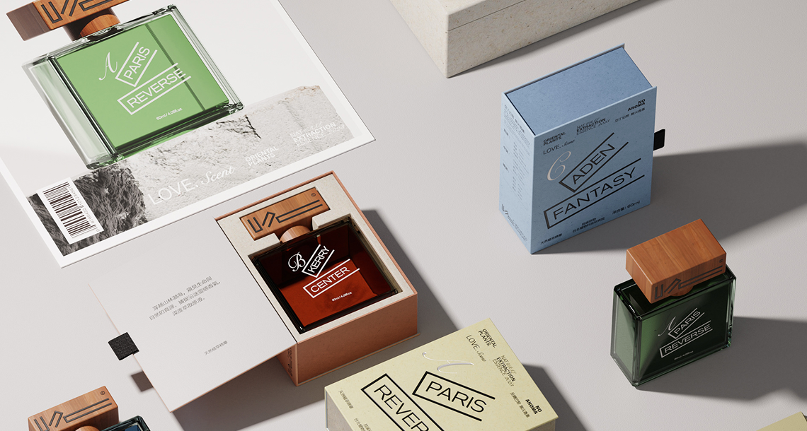
Color is the first language of a fragrance brand. Before a customer reads the name or smells the scent, they see the bottle. And what they see — or fail to see — is whether the gold on the cap matches the gold on the box, whether the frosted finish on the glass is consistent with the matte coating on the pump, whether the brand color reads the same in daylight as under retail lighting. Achieving this level of consistency across four separate packaging components is one of the most technically demanding challenges in fragrance product development. This guide explains how experienced perfume bottle manufacturers approach it.
Why Color Matching Across Components Is Harder Than It Looks
Each packaging component is made from a different substrate using a different manufacturing process. The glass bottle is colored either through mass pigmentation (color added to the molten glass) or surface coating (spray coating applied after forming). The pump head is typically injection-molded plastic with color applied through master batch pigmentation or post-mold painting. The cap may be plastic, zamak metal, or wood, each of which holds color differently. The carton box is printed using CMYK or Pantone inks on paper stock. Getting the same visual color from all four of these different materials and processes is not a matter of specifying the same Pantone number and expecting it to translate. It requires substrate-specific color matching, cross-material visual approval, and a color standard that all four production lines reference simultaneously.
Building a Color Standard Document
The foundation of consistent perfume packaging color is a master color standard document that specifies color not just as a Pantone reference but as a physical approved sample for each component type. This means an approved gold-coated glass bottle neck, an approved gold pump collar, an approved gold carton print swatch, and an approved gold cap surface — all produced simultaneously during the sample approval phase and retained as physical references at the factory. When production deviates from these physical standards, QC has an objective benchmark to evaluate against. Brands that rely only on a Pantone number without physical approved samples typically discover color drift at the final inspection stage — after the entire production run is complete.
Glass Color Options and Their Limitations
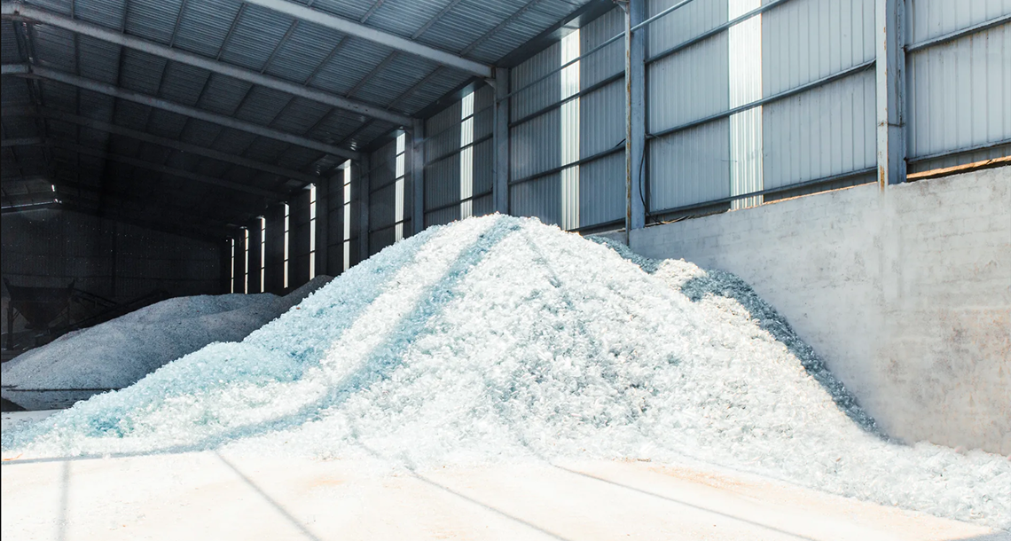
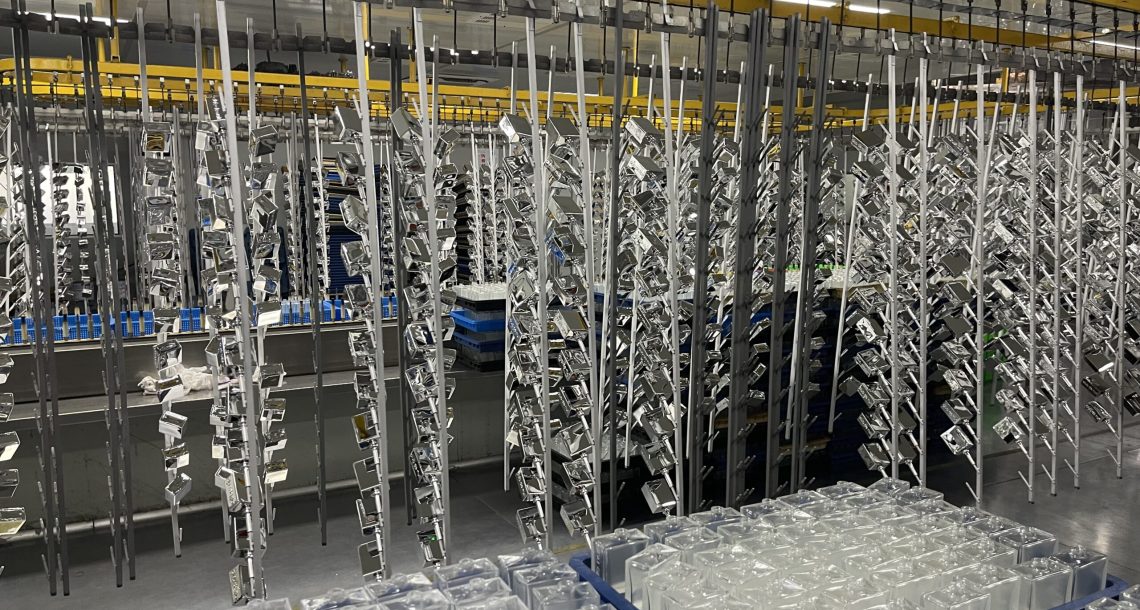
Perfume bottle manufacturers offer glass coloring through three primary methods. Mass-tinted glass — where colorants are added to the glass batch — produces the most durable and consistent result but requires minimum order quantities that make it impractical for small runs. Surface coating, applied by spraying UV-curable or solvent-based coatings onto formed bottles, offers greater flexibility and lower MOQs but is susceptible to chipping at the neck and base if the coating adhesion is not properly tested. Gradient effects — popular in contemporary luxury fragrance packaging — are applied through controlled spray masking and require skilled operators to maintain consistency across high-volume runs. Understanding which method is appropriate for your design before committing to a bottle shape is a conversation to have with your manufacturer before sampling begins.
Pump and Cap Color Coordination
Pump heads present a particular color coordination challenge because the functional components — the actuator button, the collar, and the dip tube — are often manufactured separately and assembled. A gold pump collar manufactured by one division and a gold actuator button manufactured by another can exhibit visually different gold tones even when both reference the same master batch specification. Reputable perfume bottle manufacturers control this by assembling complete pump units from components produced in the same production batch, then comparing the assembled unit against the approved color standard under standardized lighting (typically D65 daylight simulation). Caps, especially those with decorative elements such as flocking, lacquering, or UV printing, require their own color approval cycle that runs in parallel with the bottle and pump approval.
Carton Box Color and the CMYK Challenge
The outer carton box adds another color management layer because print color behaves fundamentally differently from pigment or coating color. A Pantone 872 gold prints differently on coated paper stock versus uncoated, and differently again on recycled board. Luxury fragrance brands often specify spot Pantone inks for carton printing precisely to avoid CMYK process color variability. When specifying carton color alongside glass and metal components, supply your printer with a physical approved sample of the bottle’s surface color and request a press proof match — not just a digital proof — before authorizing the print run.
The Four-Component Visual Review Process
Best-in-class perfume packaging manufacturers conduct a unified four-component color review at the sample stage. This means assembling a complete packaged unit — bottle, pump, cap, carton — and evaluating the ensemble as a whole under multiple lighting conditions. Retail lighting (warm white, approximately 3000K) and daylight (5000–6500K) can make the same color relationship look harmonious or discordant. Buyers who review components in isolation — approving the bottle one week and the carton two weeks later — often miss color relationships that are only visible when the complete package is assembled. Request a complete assembly sample, always.
Protecting Your Color System Across Reorders
Color consistency across reorders is a separate challenge from initial color matching. Glass melt batches vary slightly between production runs. Coating supplier formulations can drift between seasons. Paper stock from a specific mill can change without notice. Protecting your color system across multiple production runs requires retaining physical approved samples at the factory (not just at your office), specifying the exact coating supplier reference in your production contract, and conducting a color comparison between new samples and retained standards before every production run — not just for the first order.
→ Color consistency is one of the most frequent pain points our clients come to us with after a disappointing experience with a previous supplier. Our integrated color management process — covering glass, pump, cap, and carton simultaneously — is available for review. Contact us to see our four-component sample approval workflow in detail.